| ★ |  What is Histrogram ? How to create/make a Histogram | Explained with animated example What is Histrogram ? How to create/make a Histogram | Explained with animated example | Digital E-Learning @digitalelearning | 2.2K | India | |
| 4 |  Types and Sources of Data in Statistics | Primary & Secondary data | Qualitative & Quantitative data Types and Sources of Data in Statistics | Primary & Secondary data | Qualitative & Quantitative data | Digital E-Learning @digitalelearning | — | India | 86 |
| 9 |  Matplotlib in Python | Data Visualization with Matplotlib Explained | #Shorts | #Simplilearn Matplotlib in Python | Data Visualization with Matplotlib Explained | #Shorts | #Simplilearn | Simplilearn @simplilearnofficial | — | Estados Unidos | 85 |
| 14 |  Graphs on Alight motion (Fully Explained)" - AMV Tutorial! Graphs on Alight motion (Fully Explained)" - AMV Tutorial! | Wizzy Tutorials @wizzytutorials | — | Nigeria | 84 |
| 8 |  What is Skewness & Kurtosis ? | Difference Between Skewness and Kurtosis in Statistics What is Skewness & Kurtosis ? | Difference Between Skewness and Kurtosis in Statistics | Digital E-Learning @digitalelearning | 68.3K | India | 85 |
| 16 |  Matplotlib in Python - How to Plot Data Matplotlib in Python - How to Plot Data | | 22.5K | Estados Unidos | 84 |
| 3 | 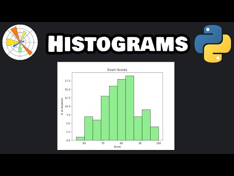 Matplotlib histograms in 6 minutes! 🔔 Matplotlib histograms in 6 minutes! 🔔 | | 3.9K | Estados Unidos | 86 |
| 1 |  What is Normality ? | Normality test - Testing For Normality [ Graphical or Statistical Method ] What is Normality ? | Normality test - Testing For Normality [ Graphical or Statistical Method ] | Digital E-Learning @digitalelearning | 3.6K | India | 88 |
| 19 |  Pie Chart Tutorial: Creating Size Distribution Graph Pie Chart Tutorial: Creating Size Distribution Graph | LearnFree @learnfree_skills | 3.1K | — | 84 |
| 10 |  Primary Data and Secondary Data in Statistics | Primary Data and Secondary data difference Primary Data and Secondary Data in Statistics | Primary Data and Secondary data difference | Digital E-Learning @digitalelearning | 2.2K | India | 85 |
| 6 |  Variance (Simply explained) | How To Calculate Variance with example ? #variance Variance (Simply explained) | How To Calculate Variance with example ? #variance | Digital E-Learning @digitalelearning | 2.0K | India | 85 |
| 5 |  What Is a Pie Chart? How to Read and Create One What Is a Pie Chart? How to Read and Create One | LearnFree @learnfree_skills | 931 | — | 85 |
| 11 |  Skewness vs Kurtosis #skewness #kurtosis #statistics #statistician #shorts #shortvideo Skewness vs Kurtosis #skewness #kurtosis #statistics #statistician #shorts #shortvideo | Digital E-Learning @digitalelearning | 894 | India | 85 |
| 7 |  What Is a Bar Chart? How to Read and Create One What Is a Bar Chart? How to Read and Create One | LearnFree @learnfree_skills | 710 | — | 85 |
| 12 |  What is a Flowchart? | Flowchart Explained with Examples | Computer Science Basics #shorts What is a Flowchart? | Flowchart Explained with Examples | Computer Science Basics #shorts | MS ScholarVerse @scholarversebymohini-154 | 538 | — | 84 |
| 17 |  Time Series Analysis Explained: Trend, Seasonality & Stationarity Time Series Analysis Explained: Trend, Seasonality & Stationarity | | 371 | India | 84 |
| 13 |  Histogram vs Frequency Polygon in Statistics Explained #Statistics #Histogram #FrequencyPolygon Histogram vs Frequency Polygon in Statistics Explained #Statistics #Histogram #FrequencyPolygon | SOURAV SIR'S CLASSES @souravdassouravsirsclass | 138 | India | 84 |
| 15 |  Introduction to Data Visualization for Beginners | Power BI Tutorial Introduction to Data Visualization for Beginners | Power BI Tutorial | Analytics with Ahmed @ahmedolaabdulsalam7343 | 34 | — | 84 |
| 2 |  Introduction to Data Visualization for Beginners - Part 2 | Mastering Visuals and Formatting Introduction to Data Visualization for Beginners - Part 2 | Mastering Visuals and Formatting | Analytics with Ahmed @ahmedolaabdulsalam7343 | 19 | — | 86 |
| 20 |  Concept of Pie Charts, Steps of Drawing Pie Charts and Its Educational Implications Concept of Pie Charts, Steps of Drawing Pie Charts and Its Educational Implications | Therefore Solve it now @thereforesolveitnow | 10 | India | 84 |
| 18 |  Data Visualization Techniques - Making Sense of Your Data (13 Minutes) Data Visualization Techniques - Making Sense of Your Data (13 Minutes) | Technology Whisper @technologywhisper | 3 | Singapur | 84 |