| ★ |  Why Your "A" Looks Off - and How to Fix It Why Your "A" Looks Off - and How to Fix It | Martina Flor @martinafloracademy | 301 | Alemania | |
| 10 | 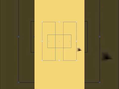 How many optical illusions? How many optical illusions? | | 58.8K | Reino Unido | 84 |
| 12 |  Why Your Outlines Look Bad (Beginner vs Pro) Adobe Illustrator CC Tutorial Why Your Outlines Look Bad (Beginner vs Pro) Adobe Illustrator CC Tutorial | | 14.9K | India | 84 |
| 8 |  It's actually the thing throwing your letters off. ✏️ It's actually the thing throwing your letters off. ✏️ | Martina Flor @martinafloracademy | 3.3K | Alemania | 85 |
| 6 |  A beautiful ornamental letter is built one layer at a time 🧢 A beautiful ornamental letter is built one layer at a time 🧢 | Martina Flor @martinafloracademy | 3.1K | Alemania | 86 |
| 2 |  Why your "i" feels off Why your "i" feels off | Martina Flor @martinafloracademy | 3.0K | Alemania | 89 |
| 4 |  4 trick to make your lettering feel complete 4 trick to make your lettering feel complete | Martina Flor @martinafloracademy | 2.7K | Alemania | 89 |
| 20 |  @tinder first rebrand in nearly a decade, and the type work is quietly brilliant. 🔥 @tinder first rebrand in nearly a decade, and the type work is quietly brilliant. 🔥 | Martina Flor @martinafloracademy | 2.6K | Alemania | 84 |
| 11 | 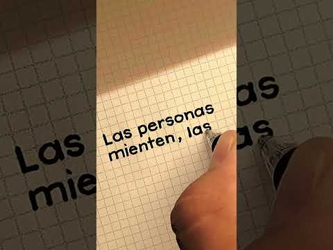 Satisfying typewriter-style calligraphy: "People lie, actions don't." ✨ #calligraphy #lettering Satisfying typewriter-style calligraphy: "People lie, actions don't." ✨ #calligraphy #lettering | | 2.1K | Bolivia | 84 |
| 14 |  Do you need a style to succeed as a lettering designer? Do you need a style to succeed as a lettering designer? | Martina Flor @martinafloracademy | 1.9K | Alemania | 84 |
| 16 |  🎨 How to Add a Stroke to Editable Text in Adobe Illustrator | Appearance Panel Tutorial 🎨 How to Add a Stroke to Editable Text in Adobe Illustrator | Appearance Panel Tutorial | Ollie Spicer @ollies_doodles_ | 1.6K | Reino Unido | 84 |
| 17 |  Quick B-Roll Ideas for Aesthetic Reels | Easy Content Creation Tips for YouTube & Instagram Quick B-Roll Ideas for Aesthetic Reels | Easy Content Creation Tips for YouTube & Instagram | Ridhi Gupta @socialmediawithridhi | 755 | Estados Unidos | 84 |
| 5 |  Why your 'P' feels off Why your 'P' feels off | Martina Flor @martinafloracademy | 688 | Alemania | 88 |
| 13 |  If diagonals are drawn the same thickness as vertical strokes, they’ll appear lighter. If diagonals are drawn the same thickness as vertical strokes, they’ll appear lighter. | Martina Flor @martinafloracademy | 452 | Alemania | 84 |
| 1 |  Why your "i" feels off Why your "i" feels off | Martina Flor @martinafloracademy | 435 | Alemania | 89 |
| 18 |  Illustrator Text Techniques You Need to Know #illustratortipsandtricks #graphicdesigntips Illustrator Text Techniques You Need to Know #illustratortipsandtricks #graphicdesigntips | Lagda Limited @lagdalimited | 311 | — | 84 |
| 19 |  4 ways to make your H more fun (without making it illegible) 4 ways to make your H more fun (without making it illegible) | Martina Flor @martinafloracademy | 307 | Alemania | 84 |
| 3 |  4 trick to make your lettering feel complete 4 trick to make your lettering feel complete | Martina Flor @martinafloracademy | 305 | Alemania | 89 |
| 7 |  4 ways to make your A more fun — without ruining it 4 ways to make your A more fun — without ruining it | Martina Flor @martinafloracademy | 220 | Alemania | 85 |
| 15 |  Two typographic lessons hidden in the GOOGLE logo — that every designer should know Two typographic lessons hidden in the GOOGLE logo — that every designer should know | Martina Flor @martinafloracademy | 218 | Alemania | 84 |
| 9 | 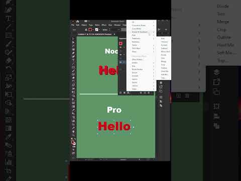 Illustrator Tips You NEED #illustratortips #adobeillustrator #designhacks #graphicdesigntips Illustrator Tips You NEED #illustratortips #adobeillustrator #designhacks #graphicdesigntips | Lagda Limited @lagdalimited | 205 | — | 85 |