| ★ |  Master Curve Tension in Recharts #DataViz Master Curve Tension in Recharts #DataViz | | 49 | — | |
| 6 |  Value graphs Explained & visualized #capcut #alightmotion #aftereffects #tutorial #editing Value graphs Explained & visualized #capcut #alightmotion #aftereffects #tutorial #editing | Wizzy Tutorials @wizzytutorials | — | Nigeria | 86 |
| 18 |  Master Welding: Pro Tips for Perfect Pipe Control & Visibility! Master Welding: Pro Tips for Perfect Pipe Control & Visibility! | Western Welding Academy @westernweldingacademy | — | Estados Unidos | 85 |
| 20 |  Not Just a Move: This Line Reveals the Secret to Mastering Perfect Curves and Turns Not Just a Move: This Line Reveals the Secret to Mastering Perfect Curves and Turns | | 3.8M | Pakistán | 85 |
| 4 |  Heatmaps to Unveil the Hidden Patterns Heatmaps to Unveil the Hidden Patterns | | 5.9K | Estados Unidos | 86 |
| 17 |  Lets Code a Data Viz Live 📊📈🔥 Lets Code a Data Viz Live 📊📈🔥 | | 3.2K | Estados Unidos | 85 |
| 7 |  Data visualization, but in 3D. 📊🔥Made by Bruceli, remix in the Spline Community 😌#3d Data visualization, but in 3D. 📊🔥Made by Bruceli, remix in the Spline Community 😌#3d | | 2.9K | Estados Unidos | 85 |
| 3 |  Excel Dashboard Charts Make Your Data Look INSANE in Minutes! #excel #exceltips #productivity Excel Dashboard Charts Make Your Data Look INSANE in Minutes! #excel #exceltips #productivity | DigiFuLL Analytics @digifullexcel | 2.5K | Estados Unidos | 86 |
| 5 | 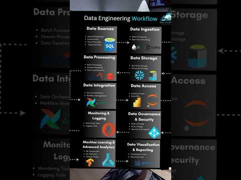 🔥 Data Engineering Workflow Explained!🔥 🔥 Data Engineering Workflow Explained!🔥 | | 1.3K | Kenia | 86 |
| 19 |  Creating Charts - Mapping and Data Visualization with Python Creating Charts - Mapping and Data Visualization with Python | Spatial Thoughts @spatialthoughts | 1.0K | India | 85 |
| 13 |  Warning: This tool may cause excessive chart obsession! 📊📈 Warning: This tool may cause excessive chart obsession! 📊📈 | Creative Tim Tutorials @creativetimofficial | 606 | — | 85 |
| 9 |  matplotlib course is officially OUT! 📈 matplotlib course is officially OUT! 📈 | | 519 | Estados Unidos | 85 |
| 11 |  JavaScript Visualizer: Understand Tricky Concepts in Seconds! JavaScript Visualizer: Understand Tricky Concepts in Seconds! | Vamshi Krishna Serla @vamshi_krishna568 | 513 | India | 85 |
| 8 |  Say Bye-Bye messy, hard to understand charts 😮💨 Say Bye-Bye messy, hard to understand charts 😮💨 | Creative Tim Tutorials @creativetimofficial | 260 | — | 85 |
| 1 |  Can I Rebuild This Epic Graph? (Live Data Viz Challenge) Can I Rebuild This Epic Graph? (Live Data Viz Challenge) | Avery Smith | Data Analyst @averysmith | 79 | Estados Unidos | 88 |
| 16 |  LEAD DATA ANALYSIS BE LIKE.. #setup #wfh #dataanalytics LEAD DATA ANALYSIS BE LIKE.. #setup #wfh #dataanalytics | MobilePixels Official @mobilepixelsofficial9835 | 76 | Estados Unidos | 85 |
| 15 |  🎥 Tableau Tutorial for Beginners: Master Data Analysis & Visualization! 🎥 - 2024 🎥 Tableau Tutorial for Beginners: Master Data Analysis & Visualization! 🎥 - 2024 | Analytics with Ahmed @ahmedolaabdulsalam7343 | 74 | — | 85 |
| 12 |  Not Another Bar Chart! Teaching Graph Choice - Special Webinar, March 2022 Not Another Bar Chart! Teaching Graph Choice - Special Webinar, March 2022 | K-12 Education Cornell Lab of Ornithology @k12_cornellbirds | 36 | — | 85 |
| 14 |  Introduction to Data Visualization for Beginners - Part 2 | Mastering Visuals and Formatting Introduction to Data Visualization for Beginners - Part 2 | Mastering Visuals and Formatting | Analytics with Ahmed @ahmedolaabdulsalam7343 | 19 | — | 85 |
| 2 |  Elevate React Charts with Tooltips #React Elevate React Charts with Tooltips #React | | 10 | — | 87 |
| 10 |  Niche Spotlight: Freelance Online Data Visualization for Micro Brands Niche Spotlight: Freelance Online Data Visualization for Micro Brands | RemoteEmpire @remote-empire-x | 1 | Turquía | 85 |