| ★ |  Matplotlib bar charts in 4 minutes! 📶 Matplotlib bar charts in 4 minutes! 📶 | | 4.1K | Estados Unidos | |
| 15 |  Matplotlib scatter plots in 6 minutes! ✨ Matplotlib scatter plots in 6 minutes! ✨ | | 4.2K | Estados Unidos | 75 |
| 4 | 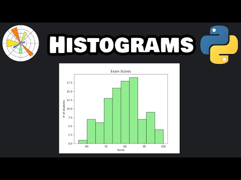 Matplotlib histograms in 6 minutes! 🔔 Matplotlib histograms in 6 minutes! 🔔 | | 3.9K | Estados Unidos | 77 |
| 10 |  Matplotlib pie charts in 6 minutes! 🥧 Matplotlib pie charts in 6 minutes! 🥧 | | 3.7K | Estados Unidos | 75 |
| 7 |  Building Generative AI Apps with Python & Streamlit Building Generative AI Apps with Python & Streamlit | | 1.9K | India | 76 |
| 9 |  What Is a Pie Chart? How to Read and Create One What Is a Pie Chart? How to Read and Create One | LearnFree @learnfree_skills | 931 | — | 75 |
| 13 |  Create Dynamic Dashboards in Excel #productivityhacks #excel #googlesheets Create Dynamic Dashboards in Excel #productivityhacks #excel #googlesheets | DigiFuLL Analytics @digifullexcel | 822 | Estados Unidos | 75 |
| 2 |  What Is a Bar Chart? How to Read and Create One What Is a Bar Chart? How to Read and Create One | LearnFree @learnfree_skills | 710 | — | 78 |
| 17 |  Spese 2025: quale categoria ha inciso di piú? Spese 2025: quale categoria ha inciso di piú? | Finanza Famigliare @finanzafamigliare | 604 | Italia | 74 |
| 8 |  Comment suivre la performance équipes en collaboration délocalisée ? (Modèle) Comment suivre la performance équipes en collaboration délocalisée ? (Modèle) | Parlons Projet by BGDP @blogdegestiondeprojet | 439 | Francia | 75 |
| 3 | 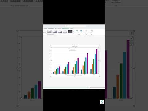 Excel → Diagramm in SEKUNDEN 😉😁🤭 Excel → Diagramm in SEKUNDEN 😉😁🤭 | | 281 | Alemania | 77 |
| 16 |  Control Charts for Means: X-bar Charts Explained (SPC Guide) Control Charts for Means: X-bar Charts Explained (SPC Guide) | | 114 | India | 74 |
| 18 |  Juego con regletas "¿Cuál regleta falta?" Juego con regletas "¿Cuál regleta falta?" | Didáctica Especializada @didacticaespecializada1528 | 29 | — | 74 |
| 19 |  Menu Driven Excel Dashboard Menu Driven Excel Dashboard | Code Station @codestation63 | 13 | India | 74 |
| 1 |  Create Bar and Pie chart in a single Dashboard #python Create Bar and Pie chart in a single Dashboard #python | Code Station @codestation63 | 10 | India | 79 |
| 20 | 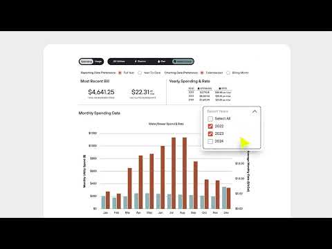 Energy Solutions Dashboard | Saving Customers Time and Money | Link Logistics Energy Solutions Dashboard | Saving Customers Time and Money | Link Logistics | Link Logistics @linklogisticsre | 6 | Estados Unidos | 74 |
| 14 |  Panel 4: Changing Technologies Panel 4: Changing Technologies | Edge Hill University Research & Knowledge Exchange @ehuresearch | 3 | Reino Unido | 75 |
| 5 | 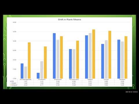 IMPACT OF 3D PRINTING ON OCCUPATIONAL THERAPY STUDENT TECHNOLOGY EFFICACY IMPACT OF 3D PRINTING ON OCCUPATIONAL THERAPY STUDENT TECHNOLOGY EFFICACY | | 0 | — | 76 |
| 11 |  Quick make chart in Excel|Excel tutorial #shorts #excel #tutorial #skills#chart#exceltutorial Quick make chart in Excel|Excel tutorial #shorts #excel #tutorial #skills#chart#exceltutorial | skill.talent @skill.talent | 0 | India | 75 |